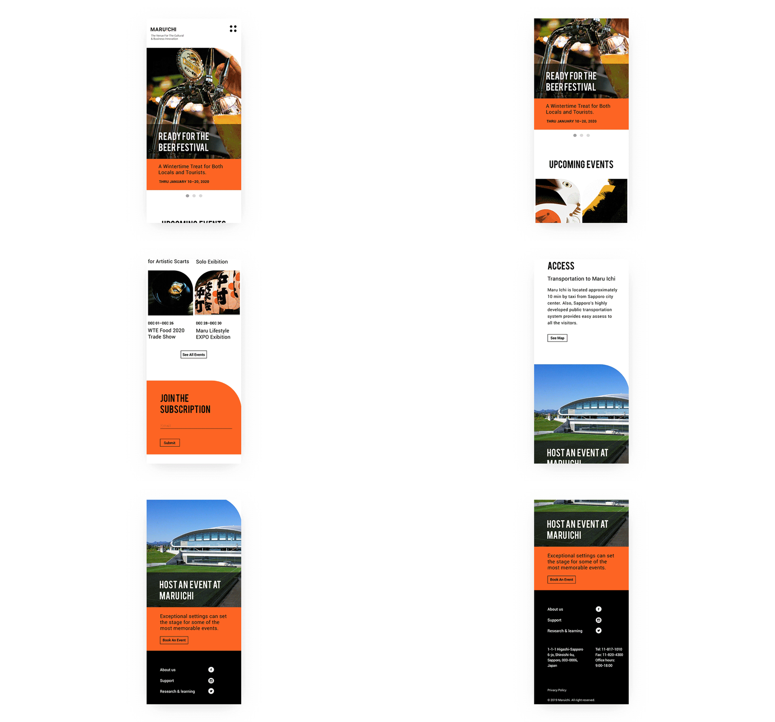
MARU ICHI
Sapporo is the fifth largest city in Japan. There is only one large venue in the city. As the city gradually shifted their economy from being focused on agriculture towards being focused on the travel industry, more people came to the city. In recent years, the city government started to develop the IT industry. They hope to make Sapporo a new business and tech hub in northern Japan. Therefore the city government is planning to build a new venue and a new brand identity for it.
SCOPE
Research
Naming
Brand Identity
Brand Concept
Print Materials
Motion Design
App Design
Art Director
Alan Barba
DEsign
Jasmine Chen
Based on research and 3 key words: Embrace, Enhance, Elevate, the name of the new venue is MARU ICHI. “Maru” in Japanese means “circle” and it also indicates the openness to, “embrace the new”. “ICHI” in Japanese means, “one”. It also can mean, “the top choice”. This is fitting as we’d want this venue to be the number one place to go to when you visit Sapporo.
Logo/icon SketcH
Inspired by the direct translation of the name of the venue Maru Ichi, circle and one (In Japanese one character looks like a horizontal stroke). I started to play with circles and lines to come up with different variation.


